 Generator
 Editor
CSS Animation Generator
Build CSS @keyframes animations visually. 11 presets, live preview, editable keyframe table, transform + opacity + color, copy production-ready CSS.
| % | X (px) | Y (px) | Scale | Rotate (deg) | Opacity | Background |
|---|
 Have feedback? Report bugs, suggest features, or share your thoughts — we read them all
CSS Animation Generator — Build @keyframes with a Live Preview
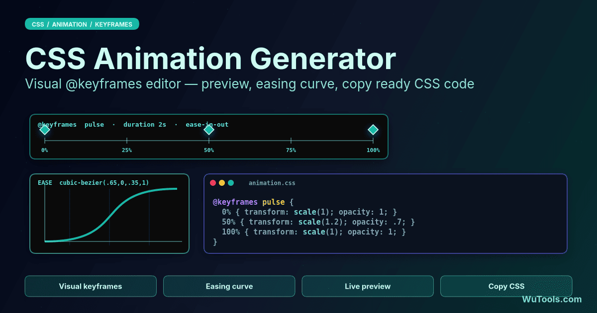
A visual editor for CSS @keyframes that runs entirely in your browser. Pick a preset to load a finished animation, then tweak duration, easing, iteration count, direction, and the individual keyframe stops (translateX, translateY, scale, rotate, opacity, background color). The preview re-renders on every change and the CSS output is regenerated as canonical, copy-ready code with a fresh @keyframes block and a one-line shorthand animation declaration.
What exactly does this tool generate?
Two blocks of plain CSS:
1. A `@keyframes <name>` block with each stop you defined (0%, 100%, plus any extra stops you added). Each stop emits only the properties that differ from the default — if you never change the background color, no `background-color` line appears. If `translate(x, y)` is zero with no scale or rotate, no `transform` is written. This keeps the output minimal and easy to read.
2. An animation shorthand: `animation: <name> <duration>s <timing-function> <delay>s <iteration-count> <direction> <fill-mode>;` — exactly the order browsers expect, so you can paste it on top of any selector.
Apply it to any element by adding the shorthand to that element's selector and ensuring the `@keyframes` block is in scope (same stylesheet or a parent stylesheet).
How does the live preview stay in sync with the CSS output?
Every change — a slider, a select, an input on the keyframe table — triggers three things in sequence:
1. The state object updates (name, duration, keyframes, etc.).
2. The CSS text is rebuilt and shown in the output pane with syntax highlighting.
3. A scoped `<style>` element with a `__preview` suffix on the animation name is injected (or replaced) in the page head, then the box's class is removed and re-added in the next animation frame to force a restart.
The `__preview` suffix prevents a name collision with a copy of the same CSS already on the page, and the reflow trick (`void box.offsetWidth`) is what makes 'Replay' work even when the animation has run to completion. There's no JavaScript driving the motion — the browser's compositor handles every frame, which is why the preview is smooth even on a low-end device.
Which presets are included and what makes a good starting point?
Eleven presets cover the most common patterns:
- **fade-in / zoom-in / zoom-out** — entrance and exit animations using opacity and scale.
- **slide-in-left / slide-in-right** — translate from offscreen to position, ease-out for natural deceleration.
- **bounce** — vertical translate with three peaks, ease-in-out, infinite.
- **pulse** — scale up to 1.05 then back, infinite, useful for 'attention' buttons.
- **shake** — short horizontal oscillation for error states.
- **rotate-360** — single full revolution, linear easing, infinite — for spinners.
- **flip** — a 2D `rotate(180deg)` turn that alternates back and forth.
- **color-cycle** — animates background-color through hue stops.
If you're not sure where to start, pick the one closest to your intent and then tune duration and easing. Most production animations are 200–400ms (for UI interactions), 800–1500ms (for hero entrances), or infinite (for loaders).
What does the timing function actually control?
The timing function is the easing curve — it maps animation time (0 to 1) to a progress value, which determines how the box moves between any two keyframes.
The presets cover four families:
- **linear** — constant speed. Best for spinners, anything that should feel mechanical.
- **ease / ease-in / ease-out / ease-in-out** — built-in cubic bézier curves. Best for UI motion; `ease-out` is the most common because it feels natural (fast start, gentle stop).
- **cubic-bezier(0.34, 1.56, 0.64, 1)** — overshoot. The y-coordinate of P2 is greater than 1, so the animation goes past the target and settles. Great for playful entrances.
- **steps(N, end)** — jumps in N discrete steps. Best for sprite-sheet animations or typewriter effects where you don't want smooth interpolation.
The timing function applies between every pair of keyframes unless you override it per-stop in raw CSS (this tool uses one curve for the whole animation, which matches 95% of real-world use).
How are keyframe percentages used and what's the minimum?
A `@keyframes` block needs at least two stops — usually `0%` and `100%` — to describe a start and end state. You can add more stops to define intermediate poses; the browser interpolates between consecutive stops using the timing function.
For example, a bounce that lifts the box at the midway point uses:
```
0% { transform: translateY(0); }
50% { transform: translateY(-40px); }
100% { transform: translateY(0); }
```
The table in this tool keeps stops sorted by percent, and rejects deletion if only two remain (the minimum). Two convenient aliases CSS also accepts — `from` and `to` — map to `0%` and `100%` respectively, but this tool always writes the numeric form for consistency.
If you want a property to 'snap' rather than interpolate, place two adjacent stops one percent apart (e.g., `49% { x: 0 } 50% { x: 100 }`).
What's the difference between iteration count, direction, and fill mode?
These three properties control how the animation behaves over time:
- **iteration-count** — how many times to play. `1` (default) plays once and stops in the unanimated state; `infinite` loops forever; any positive number (including fractions like `2.5`) plays that many times.
- **direction** — `normal` plays 0%→100% each time; `reverse` plays 100%→0%; `alternate` swaps each iteration (0→100, then 100→0, then 0→100…); `alternate-reverse` is alternate starting backwards.
- **fill-mode** — what to display when the animation isn't running. `none` (default) reverts to the unanimated state at the end (and shows the unanimated state during the `delay`). `forwards` keeps the last keyframe applied after the animation ends. `backwards` applies the first keyframe during the delay. `both` does both.
A common 'fade-in then stay' pattern uses `iteration-count: 1`, `direction: normal`, and `fill-mode: forwards` so the box stays visible after fading in.
How do I use the generated CSS in my project?
Three steps:
1. Click **Copy** to grab both the `@keyframes` block and the `animation: …` shorthand.
2. Paste them into your stylesheet. The `@keyframes` block can live anywhere in your CSS — at the top, bottom, in a `<style>` tag, in a `.css` file linked from your HTML. Keep both together for clarity.
3. The shorthand has the animation applied to `.element` by default — change `.element` to your selector (e.g., `.modal`, `#hero-image`, `.btn-attention`). If you want it on hover, scope the shorthand to `:hover`. If you want it conditionally, add or remove the class with JavaScript.
If you need the animation in multiple components with different durations, define the `@keyframes` once and write multiple `animation:` shorthand lines with the same name but different durations.
For production, you can also use the longhand form (`animation-name`, `animation-duration`, etc.) if you need to override only one property in a media query — but the shorthand is more compact for the initial declaration.
Is this tool private? Does it send my animation anywhere?
Yes, fully private. Everything runs in your browser:
- The preview is a `<style>` block injected into the same page — no canvas recording, no server roundtrip, no telemetry.
- The CSS output is generated by template strings in JavaScript; nothing is sent to a server when you change a slider or pick a preset.
- The Copy button uses the browser's clipboard API directly.
- No external animation library is loaded (no GSAP, no anime.js, no Framer Motion) — the output is pure CSS that browsers have supported since IE10.
You can verify by opening DevTools → Network and watching the panel while you tune the animation — no requests should fire. This also means the tool works offline once the page has loaded, and any `name` you choose for your animation stays in your browser.
What does the prefers-reduced-motion guard do, and why does it matter?
Enable the **prefers-reduced-motion guard** toggle above the output and the generated CSS is wrapped to respect the user's motion preference:
```
@media (prefers-reduced-motion: no-preference) {
.element { animation: myAnimation 1s ease 0s infinite normal none; }
}
@media (prefers-reduced-motion: reduce) {
.element { animation: none; /* final keyframe state, e.g. opacity: 1; */ }
}
```
The motion only plays for users who have NOT asked their OS for reduced motion (System Settings → Accessibility → Reduce Motion on macOS/iOS, or the equivalent on Windows/Android/GNOME). Users who *have* requested reduced motion get `animation: none` plus the element's final keyframe state, so they still see the correct end pose without the movement.
This is a WCAG 2.1 best practice (SC 2.3.3 Animation from Interactions, and it supports SC 2.2.2 Pause, Stop, Hide). Honoring it is mandatory in most enterprise front-end style guides and is flagged by Lighthouse and axe accessibility audits. The `@keyframes` block stays outside the media queries so it can be reused. The live preview deliberately keeps animating regardless of the toggle — it is a dev aid; only the copied code changes.
How do I keep these animations smooth (GPU compositing, will-change)?
Animate only the two properties the browser can composite on the GPU without repainting: `transform` and `opacity`. This tool's keyframes use exactly those (translate, scale, rotate, opacity) plus `background-color`. `background-color` cannot be composited and triggers paint on every frame — fine for a single small element, but avoid it on large or many elements.
For heavy or frequently-running animations you can hint the compositor with `will-change: transform, opacity;` on the animated element so the browser promotes it to its own layer ahead of time. Use it sparingly: leaving `will-change` on dozens of elements wastes GPU memory. A common pattern is to add it on `:hover`/just before the animation starts and remove it after. Avoid animating layout properties (`width`, `height`, `top`, `left`, `margin`) — they force reflow and jank; use `transform: translate()`/`scale()` instead, which this generator already does.
How do I debug @keyframes in browser DevTools?
Modern DevTools have a dedicated Animations panel:
- **Chrome/Edge**: open DevTools → press `Esc` for the drawer → `…` menu → **Animations**. Trigger the animation and it captures the timeline; you can scrub it, slow playback to 25%/10%, and click a keyframe to jump to the rule.
- **Firefox**: Inspector → **Animations** tab shows each running animation with its easing curve and lets you pause/scrub.
In the **Styles** pane you can also edit the `@keyframes` rule live, toggle the `animation-play-state`, and hover the cubic-bezier swatch to open an editable easing-curve editor. To confirm GPU compositing, enable **Rendering → Layer borders** (or the Layers panel) — a composited animated element gets its own layer. If an animation never starts, check that the `@keyframes` name in the shorthand exactly matches the block name and that both are in scope.
Do I need vendor prefixes for cross-browser support?
No — for current browsers. `@keyframes`, the `animation` shorthand, and `prefers-reduced-motion` are unprefixed and supported in all evergreen browsers (Chrome, Edge, Firefox, Safari) and have been for years. This tool intentionally emits clean, unprefixed CSS.
You only need `-webkit-` prefixes (`@-webkit-keyframes`, `-webkit-animation`) if you must support very old Safari/iOS (pre-9) or legacy Android browsers — rare in 2025. If your build pipeline uses **Autoprefixer** (via PostCSS, configured by a `browserslist`), it will add any required prefixes automatically at build time, so you should keep the source unprefixed and let the tooling decide. `prefers-reduced-motion` has no prefixed form; browsers that don't understand the media query simply ignore the `reduce` block and fall through to the `no-preference` rule, which is a safe default.
Key Features
- 11 preset animations: fade-in, slide-in-left/right, bounce, pulse, shake, rotate-360, zoom-in/out, flip, color-cycle
- Editable keyframe table with translateX, translateY, scale, rotate, opacity, background color
- Live preview re-renders on every change; pause/replay controls
- 9 timing functions including cubic-bezier (overshoot) and steps()
- Direction (normal/reverse/alternate/alternate-reverse) and fill-mode (none/forwards/backwards/both)
- Iteration count: 1, 2, 3, infinite, or any positive number
- Adds intermediate keyframes at midpoint, auto-sorts by percentage
- Minimum two stops enforced; delete button disabled at minimum
- Generates canonical @keyframes block and animation shorthand
- prefers-reduced-motion guard: emits WCAG-compliant accessible CSS with a reduced-motion fallback
- Syntax-highlighted CSS output with light/dark mode colors
- Copy-to-clipboard with one click
- No external animation libraries — pure CSS output, browser-native
- Works offline after first load
- Mobile-friendly responsive layout
- 100% client-side — nothing sent to a server
 COLOR TOOLS31
- Border Radius Generator
- CSS Clip-path Maker
- Glassmorphism Generator
- Color Picker Pro
- Flexbox Generator
- Box Shadow Generator
- CSS Animation
- Clamp() Calculator
- Cubic Bezier Editor
- Color Blindness Simulator
- Color Contrast Checker
- Color Converter
- Color Harmony Generator
- Color Mixer
- Color Palette Generator
- Color Shades Generator
- Color Temperature
- Dark Mode Pair Generator
- Gradient Generator
- Image Color Picker
- CSS Specificity

- Dominant color extractor

- Video Color Filter

- cmyk to rgb

- hex to rgb
- hsl to rgb
- hsv to rgb
- rgb to cmyk
- rgb to hex
- rgb to hsl
DEVELOPER TOOLS93 WUTOOLS