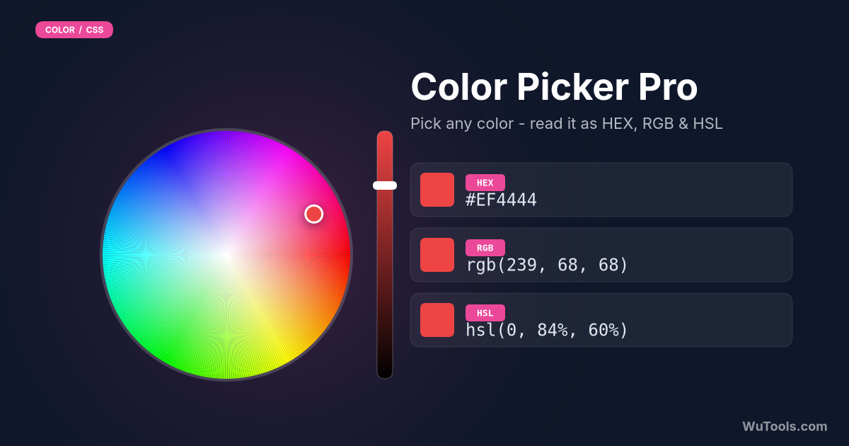
Color Picker Pro
Pro color picker with harmonies, shades, tints, gradients, HEX/RGB/HSL/CMYK and live WCAG contrast ratios with AA/AAA pass-fail badges.
 Have feedback? Report bugs, suggest features, or share your thoughts — we read them all
Color Picker Pro - Professional Color Tool
Advanced color picker with professional features for designers, developers, and artists. Generate color harmonies, create shades and tints, preview gradients, save favorite colors, and get detailed color information. All features work offline with instant updates. See also our Color Mixer and Color Contrast Checker.
What is the difference between HEX, RGB, HSL, and CMYK?
These are four ways to describe the same color, each suited to a different workflow. HEX is a 6-digit base-16 shorthand for RGB (#FF5733); it is the standard in HTML and CSS because it is compact and copy-paste friendly. RGB expresses the same value as three channels of 0-255 (rgb(255,87,51)) and is the format you manipulate in JavaScript or canvas code. HSL re-parameterises the same color as Hue, Saturation, and Lightness (hsl(9,100%,60%)); it is the most human-friendly model for theming because you can hold the hue and adjust only lightness to make tints and shades. CMYK uses Cyan, Magenta, Yellow, and Key/black percentages and exists for printing — your screen cannot truly display CMYK, so the values you see here are a mathematical approximation.
How do I pick a color and copy it in one click?
Click the main color swatch to open your browser's native color picker, drag inside the gradient and along the hue slider until you find the color you want, then close the dialog. The four format fields (HEX, RGB, HSL, CMYK) update in real time. Click any field — or its copy icon — to copy that representation to your clipboard; a toast confirms the copy. To pick a color you have seen on screen, use the system-level eyedropper offered by Chrome (the small dropper icon inside the native picker on Chromium browsers). To experiment quickly, hit the Random button repeatedly until something resonates, then refine by nudging HSL values. Save the result with the Save button to keep it in the local-storage swatch library for later sessions.
What are color harmonies and when should I use each one?
Color harmonies are mathematically related groups of hues that the eye reads as pleasant together. Complementary (opposite on the wheel, blue + orange) gives the loudest contrast — use for one accent against a neutral background. Analogous (three hues 30 degrees apart) feels natural and serene — use for editorial pages and nature themes. Triadic (three hues 120 degrees apart) is bold and balanced — use for playful brands and infographics. Tetradic (two complementary pairs forming a square) is the richest and trickiest — let one hue dominate while the others support. Monochromatic (one hue, many lightnesses) is the safest choice — use for sophisticated minimal UI. Apply the 60-30-10 rule: 60% dominant, 30% secondary, 10% accent, regardless of which harmony you choose.
What is the difference between shades, tints, and tones?
In classical color theory, a shade is your base color mixed with black (darker, often more dramatic); a tint is your base color mixed with white (lighter, often softer); a tone is your base color mixed with gray (more muted, often more sophisticated). In digital terms these are all HSL adjustments: a shade drops lightness, a tint raises lightness, and a tone drops saturation. Design systems normally generate a 9-step ramp from 50 (lightest tint) to 900 (darkest shade) for every brand color so that any UI element — buttons, alerts, backgrounds, borders — can pull a consistent value off the same hue. This tool generates shades and tints automatically; copy the whole strip as a starting point for your design tokens.
How do I create a CSS linear or radial gradient from this picker?
Pick your main color, then choose a harmony like Analogous or Complementary to get a second color the eye will accept as a smooth blend. Switch the gradient preview between Linear and Radial. Linear gradients flow in a straight line set by an angle (linear-gradient(135deg, #A 0%, #B 100%)) and are best for backgrounds, hero sections, and buttons; 135deg is the safest default because it reads as natural light from top-left. Radial gradients emanate from a focal point (radial-gradient(circle at center, #A, #B)) and are best for glow effects, spotlights, and orb-style avatars. Copy the generated CSS string directly into your stylesheet. For best contrast, place text on a solid overlay rather than directly on the gradient.
How does the tool decide whether to recommend white or black text on my chosen color?
It computes the WCAG relative luminance of the background: convert each RGB channel to a linear value, then take the weighted sum L = 0.2126 R + 0.7152 G + 0.0722 B (green dominates because the human eye is most sensitive to it). It then measures the actual contrast ratio of the color against pure white and against pure black, and recommends whichever yields the higher ratio. This is the genuine WCAG decision, not an NTSC-brightness shortcut, so it never picks the lower-contrast option even for saturated mid-tones. The recommended color updates the moment you change the main color, and the Contrast & Accessibility panel shows you the exact ratios.
What contrast ratio do I need for WCAG compliance?
WCAG 2.1 sets minimum text-to-background contrast ratios that depend on text size and conformance level. For Level AA — the legal baseline for ADA in the US and EN 301 549 in the EU — normal body text must reach at least 4.5:1, while large text (18pt / 24px regular, or 14pt / 18.66px bold) only needs 3:1 because bigger glyphs are easier to read. For the stricter Level AAA, normal text must reach 7:1 and large text 4.5:1. UI components and graphical objects (icons, form borders, focus rings) need 3:1 against adjacent colors. This tool reads your picked color as the background and shows its contrast against both white and black text, tagging each with an AAA, AA, AA Large, or Fail badge so you can confirm compliance before shipping — but always test the real foreground/background pair you intend to ship, since your text is rarely pure white or pure black.
How can I save brand colors and rebuild a palette later?
Pick or paste your color, then click Save. The tool stores each swatch in your browser's localStorage, so it survives page reloads and closing the tab but stays on this one device. Save your full brand spectrum upfront — primary, secondary, three or four accents, a neutral, and any semantic colors (success, warning, danger) — and you have a personal palette library that loads instantly each visit. Click any saved swatch to push it back into the main color slot, then derive harmonies, gradients, or tint ramps from it. For team sharing, export the HEX values into a design-token JSON or paste them into a Figma styles document; localStorage cannot sync across devices on its own. Use Clear All to wipe the library when starting a new client project.
What are the color-blindness implications when designing with a five-color palette?
About 8% of men and 0.5% of women have some form of color vision deficiency, most commonly red-green confusion (deuteranopia and protanopia). A palette that depends on red versus green to convey meaning (a red error icon next to a green success icon, for example) will read as identical for these users. Three defences: (1) never use color alone to convey state — add an icon shape, label, or pattern; (2) test your palette through a color-blindness simulator (the Color Blindness Simulator on this site is one); (3) prefer hue differences along the blue-yellow axis when you must rely on color, because those discriminations survive most types of color blindness. Run your final foreground/background pairs through both a WCAG contrast checker and a CVD simulator before shipping.
Professional Features
- Advanced color picker with large preview
- 5 color harmony modes (Complementary, Analogous, Triadic, Tetradic, Monochromatic)
- Generate shades (darker) and tints (lighter) automatically
- Create linear and radial gradients with preview
- Save unlimited favorite colors to browser
- Copy all color formats (HEX, RGB, HSL, CMYK, CSS gradients)
- Real-time color information (brightness, WCAG luminance)
- Inline WCAG contrast ratios vs white and black with AA/AAA badges
- Best text color recommendation driven by real WCAG contrast
- Click any color to use it as main color
- Instant updates - no convert button needed
- 100% client-side processing
- Works offline after first load
- Dark mode support
- Mobile-friendly responsive design
- Export color palettes
- Professional-grade color tools
 COLOR TOOLS31
- Border Radius Generator
- CSS Clip-path Maker
- Glassmorphism Generator
- Color Picker Pro
- Flexbox Generator
- Box Shadow Generator
- CSS Animation
- Clamp() Calculator
- Cubic Bezier Editor
- Color Blindness Simulator
- Color Contrast Checker
- Color Converter
- Color Harmony Generator
- Color Mixer
- Color Palette Generator
- Color Shades Generator
- Color Temperature
- Dark Mode Pair Generator
- Gradient Generator
- Image Color Picker
- CSS Specificity

- Dominant color extractor

- Video Color Filter

- cmyk to rgb

- hex to rgb
- hsl to rgb
- hsv to rgb
- rgb to cmyk
- rgb to hex
- rgb to hsl
 WUTOOLS