 Analyzer
 Tester
Color Contrast Checker
Free WCAG 2.1 & APCA color contrast checker. Test text and background for AA/AAA accessibility, with a size-driven verdict for ADA & Section 508 compliance.
 Pass Pass Pass Pass
 Have feedback? Report bugs, suggest features, or share your thoughts — we read them all
Color Contrast Checker - WCAG Accessibility Tool
A comprehensive color contrast checker that evaluates foreground and background color combinations against WCAG 2.1 guidelines. Tests both AA and AAA compliance levels for normal text (under 18pt or 14pt bold) and large text (18pt and larger, or 14pt bold and larger). Features include real-time contrast ratio calculation, color adjustment tools, preset combinations, and recommendations for improving accessibility. Essential for designers, developers, and anyone creating accessible web content. See also our Color Palette Generator and Color Picker Pro.
Why does the WCAG AA contrast ratio matter for my website?
WCAG 2.1 AA is the accessibility benchmark referenced by most accessibility laws worldwide — the ADA in the United States, the European Accessibility Act, the UK Equality Act, and Section 508 for federal procurement. Failing AA contrast (4.5:1 for body text, 3:1 for large text) means readers with low vision, age-related macular changes, color blindness, or even just glare on a phone screen cannot reliably read your content. It also costs you money: roughly 1 in 4 adults has some functional vision limitation, search engines de-rank low-accessibility pages under helpful-content signals, and lawsuits for inaccessible commerce sites have jumped year over year. Treating AA as the floor (not the ceiling) gets you legal safety, broader reach, and better SEO at the same time.
What is the difference between WCAG AA and AAA contrast levels?
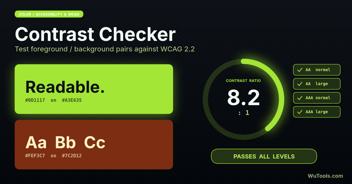
AA is the minimum legally referenced level: 4.5:1 contrast for normal body text (under 18pt regular or 14pt bold) and 3:1 for large text (18pt regular and up, or 14pt bold and up). AAA is the enhanced level: 7:1 for body text and 4.5:1 for large text. AA is meant to be achievable while preserving most brand design choices; AAA is meant for content where accessibility is mission-critical — government services, healthcare, finance, education for the elderly. AAA is harder to meet because vibrant or pastel brand colors rarely clear 7:1 against white. The pragmatic recipe most teams follow: target AA across all UI, push body copy to AAA when possible by using pure black or near-black text on pure white surfaces, and never let any active control fall below AA.
How exactly is the contrast ratio calculated?
WCAG uses the formula (L1 + 0.05) / (L2 + 0.05), where L1 is the relative luminance of the lighter color and L2 of the darker color. Relative luminance is computed per pixel: convert each RGB channel from 0-255 to a 0-1 fraction, apply sRGB gamma correction (channel / 12.92 if channel ≤ 0.03928, otherwise ((channel + 0.055) / 1.055)^2.4), then sum L = 0.2126 R + 0.7152 G + 0.0722 B. The weights match how cone cells in the eye respond — green dominates because it falls in the most sensitive band. The 0.05 constant prevents division by zero for pure black. Pure black on pure white yields the maximum possible ratio of 21:1; pure white on white gives 1:1. Anything below 3:1 fails for any text size.
What if my brand color does not pass — do I have to change the brand?
No — you change where you use the brand color, not the brand itself. The pattern most design systems follow: lock the original brand HEX as a "marketing" or "decorative" token, used for logos, hero backgrounds with overlay text, and large display type where 3:1 is enough. Then generate accessible derivatives by darkening the brand color until it clears 4.5:1 against white (or lightening it for dark themes), and use those derivatives for buttons, links, and body text. Tailwind, Material, and IBM Carbon all ship paired ramps for exactly this reason. The Lighten and Darken buttons in this tool find the nearest passing value while keeping the same hue, so the derivative still feels on-brand.
When does the 3:1 contrast threshold apply instead of 4.5:1?
Three situations qualify for the lower 3:1 threshold under WCAG 2.1. First, large text — defined as at least 18pt regular weight (about 24px) or 14pt bold (about 18.5px) — because larger letterforms are easier to discriminate. Second, non-text UI components such as form input borders, focus outlines, icons, and graphical objects (under SC 1.4.11): they must reach 3:1 against adjacent colors, not 4.5:1. Third, incidental text in logos or pure decoration. Important traps: button labels are normal text and need 4.5:1 even if the button itself is large; placeholder text needs 4.5:1 because it conveys instructions; and disabled UI is exempt only if it cannot be interacted with at all. When in doubt, target 4.5:1 — it covers most cases without separate audits.
How do I improve contrast without breaking the design layout?
Five low-risk levers. (1) Darken the foreground in HSL by 10-20% lightness — hue stays the same, brand feels unchanged. (2) Bold the text: a 14pt bold cleared at 3:1 instead of 4.5:1, so weight does some of the work. (3) Increase font size to cross the large-text threshold (18pt regular or 14pt bold) and the ratio requirement drops. (4) Add a subtle solid background under the text rather than placing it on a busy gradient or image — overlay layers (a rgba(0,0,0,0.55) wash) restore consistent contrast across whole sections. (5) Use a different color pair altogether for the failing pairing, even if the rest of the palette keeps the brand colors — for example, use brand teal for backgrounds but a near-black slate for any text on a white card.
How do I handle contrast on top of gradients, photos, or video backgrounds?
Image and gradient backgrounds change contrast pixel by pixel, so the checker cannot evaluate every position automatically — you need to identify the worst-case spot. Three standard fixes: (1) Overlay a semi-transparent flat color between the background and the text (background-image: linear-gradient(rgba(0,0,0,0.55), rgba(0,0,0,0.55)), url("hero.jpg");) so the foreground sees a uniform background; sample that combined background color in the contrast checker. (2) Wrap text in an opaque card with its own solid fill so it never touches the underlying media. (3) Add a soft text shadow (text-shadow: 0 1px 4px rgba(0,0,0,0.65)) to lift letterforms from busy areas; shadows do not replace contrast but raise the effective ratio on most monitors. WCAG 2.1 SC 1.4.3 still applies to the rendered text-on-background combination, so test in a real browser, not just the design file.
Does APCA (the proposed WCAG 3 contrast algorithm) make these results obsolete?
Not for current compliance. APCA (Accessible Perceptual Contrast Algorithm) is a polarity-aware perceptual model being explored for WCAG 3, which is still in draft and not yet legally referenced anywhere. WCAG 2.1 and 2.2 — both of which use the simple luminance ratio formula this tool implements — remain the actively cited standard in laws, court cases, and procurement guidelines through 2026 and almost certainly beyond. APCA does fix real limitations: the 2.x formula under-weights mid-tone gray contrasts and treats light-on-dark identically to dark-on-light even though the eye perceives them differently. The pragmatic recipe today: use WCAG 2.1 ratios for compliance (this tool), preview body text with an APCA value too if your design system supports it (Sass-WCAG or APCA online), and recheck once WCAG 3 reaches Candidate Recommendation status.
Why does this tool ask for my font size and weight, and how does the single verdict work?
Because the legal threshold changes with size, and that is exactly where teams misclassify text. Enter the real font size in pixels and tick Bold if the type is bold, and the checker emits one definitive verdict — Passes AAA, Passes AA, or Fails AA — for that specific element, instead of leaving you to read four grid cells. Under WCAG 2.1 SC 1.4.3, text counts as Large only at 18pt regular (about 24px) or 14pt bold (about 18.66px) and up; Large text needs just 3:1 for AA and 4.5:1 for AAA, while Normal text needs 4.5:1 for AA and 7:1 for AAA. The classic trap: a big button looks 'large', but its label is usually normal-weight body text under 24px, so it still needs 4.5:1 — the size-driven verdict catches that automatically. Two cautions beyond body text: per SC 1.4.11, non-text UI components — focus rings, input borders, icons, and other graphical objects — only need 3:1 against adjacent colors regardless of size, so a focus ring or icon contrast check uses the 3:1 bar, not 4.5:1. Switch to APCA mode and the same size input maps to the matching Lc target (75 for small body, 60 for content, 45 for large) and the verdict re-evaluates against the live Lc value.
Key Features
- Real-time contrast ratio calculation
- WCAG 2.1 AA compliance checking
- WCAG 2.1 AAA compliance checking
- Normal text contrast (4.5:1, 7:1)
- Large text contrast (3:1, 4.5:1)
- Live preview of color combinations
- Sample text in normal size
- Sample text in large size
- Pass/Fail indicators for each level
- Color picker for foreground
- Color picker for background
- Manual hex color input
- Swap foreground/background colors
- Lighten/Darken color adjustment
- Suggest similar passing colors
- Preset high contrast combinations
- Color information display (HEX, RGB, HSL)
- Relative luminance calculation
- Detailed WCAG explanations
- Responsive mobile design
- Dark mode support
- 100% client-side processing
- No data sent to servers
- Copy color codes to clipboard
- Accessibility-focused design
 COLOR TOOLS31
- Border Radius Generator
- CSS Clip-path Maker
- Glassmorphism Generator
- Color Picker Pro
- Flexbox Generator
- Box Shadow Generator
- CSS Animation
- Clamp() Calculator
- Cubic Bezier Editor
- Color Blindness Simulator
- Color Contrast Checker
- Color Converter
- Color Harmony Generator
- Color Mixer
- Color Palette Generator
- Color Shades Generator
- Color Temperature
- Dark Mode Pair Generator
- Gradient Generator
- Image Color Picker
- CSS Specificity

- Dominant color extractor

- Video Color Filter

- cmyk to rgb

- hex to rgb
- hsl to rgb
- hsv to rgb
- rgb to cmyk
- rgb to hex
- rgb to hsl
 WUTOOLS