 Calculator
 Generator
CSS clamp() & Fluid Typography Calculator
Free CSS clamp() calculator for fluid typography with rem/px output, CSS custom properties and Utopia-style type scales. Live preview plus a WCAG 1.4.4 zoom-safe check.
| Name | Min Size (px) | Max Size (px) | CSS clamp() | WCAG Zoom |
|---|
 Have feedback? Report bugs, suggest features, or share your thoughts — we read them all
CSS clamp() & Fluid Typography Calculator
Generate copy-ready CSS clamp() expressions for fluid typography and responsive sizing. Define a min and max viewport, then any number of values (font sizes, spacing, line heights) with their min and max. The calculator emits a clamp() that scales linearly between the two viewport widths and clamps at each boundary. A live preview renders sample text at the simulated viewport so you can sanity-check the curve. Built-in type scale presets (Major Third, Perfect Fourth, Golden Ratio, etc.) generate a full h1–h6 hierarchy in one click.
What is the CSS clamp() function and why use it for typography?
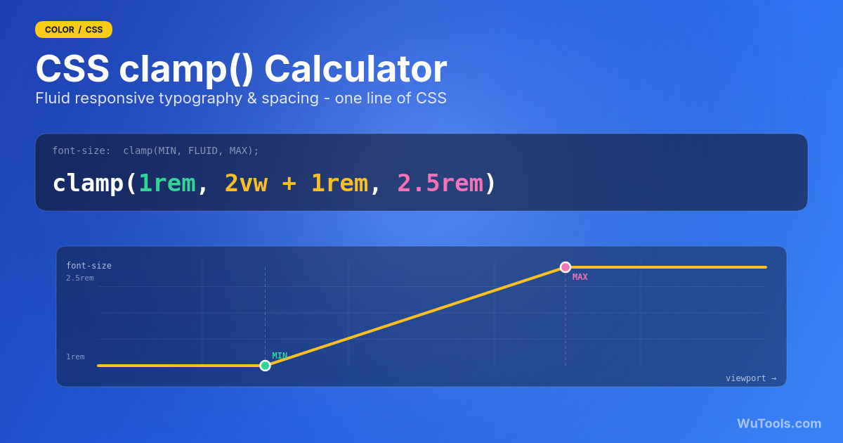
clamp(MIN, PREFERRED, MAX) returns the preferred value, unless it's below MIN (then MIN) or above MAX (then MAX). For typography, the trick is to make PREFERRED a fluid expression based on vw units — so the size grows linearly with the viewport between the two bounds.
Example: font-size: clamp(1rem, 0.857rem + 0.714vw, 1.5rem) gives 16px at 320px wide, 24px at 1440px wide, and stays clamped outside that range.
Benefits over media queries:
- One declaration instead of three or four.
- The size truly scales — no jumps at breakpoints.
- Respects user zoom (when you use rem for MIN/MAX, which this tool does by default).
- Browser support since 2020: Chrome 79, Safari 13.1, Firefox 75 — universally supported in modern browsers.
How does the math behind this work?
Given a min size at the min viewport (m1, v1) and a max size at the max viewport (m2, v2), we want a linear function f(x) = a·x + b that passes through both points.
- Slope: a = (m2 − m1) / (v2 − v1)
- Intercept: b = m1 − a · v1
The PREFERRED expression in clamp() needs to be valid CSS, so we use vw units. Since 1vw = viewport_width / 100, the formula becomes:
PREFERRED = b + (a · 100) vw
When using rem, both b and the MIN/MAX get divided by the root font size (default 16px). The slope coefficient stays in vw because vw is a viewport-relative unit and is not affected by the root size.
This is the same formula behind Utopia and Modern Fluid Typography. The calculator outputs the values rounded to 3 decimals to keep CSS readable.
Should I use rem or px for the MIN and MAX?
Use rem in production. Reasons:
- User zoom respect. When a user sets their browser's default font size to 20px (instead of 16px) for accessibility, rem values scale; px values don't. Locking text size at 16px regardless of user preference is a WCAG accessibility issue.
- Type-scale consistency. Defining sizes in rem keeps them proportional across the document if you later tune the root font size.
- The vw component handles fluidity regardless of unit choice for the constants — it's the MIN/MAX bounds where rem matters.
Use px if you're sizing something where pixel-perfect output is the goal (a specific icon size, a fixed-grid layout). For text, rem almost always wins.
Is my clamp() accessible? (WCAG 1.4.4 zoom safety)
WCAG 2.x Success Criterion 1.4.4 (Resize Text) requires that text can be enlarged up to 200% without loss of content or function. A clamp() can silently fail this — and get flagged in Lighthouse, axe or a manual audit — when the vw term dominates and the relative (rem) portion is too small or negative. Because vw is tied to the layout viewport (not the user's font-size or zoom setting), if almost all of the preferred value comes from vw, zooming the browser barely enlarges the text.
The rule of thumb auditors apply: always keep a meaningful rem component in the preferred expression. A common safe pattern is that the rem constant should contribute at least roughly half of the value, so that doubling the rem part on zoom still pushes the result toward 200%.
This tool runs that check for you. Each row shows a 'WCAG Zoom' badge: green 'Zoom-safe' when the value still reaches ~200% at 2x browser zoom, red 'Fails zoom' when it doesn't, and a warning when you output in px (px text ignores the user's font-size preference entirely and is never zoom-safe for body text). To fix a failing row: switch Output Unit to rem, raise the smaller bound, or widen the gap between MIN and MAX so the constant carries more of the size.
What viewport range should I pick for min and max?
The fluid range is from the smallest device you support to the widest typical layout. Common picks:
- 320 → 1440: very common; covers iPhone SE narrow up to a laptop / 1440p design width.
- 360 → 1280: 'modern phone' to standard desktop; preferred when you don't optimise for tiny screens.
- 375 → 1920: iPhone reference width up to a full-HD widescreen.
The key idea: pick values that match where your content lives. Outside the range, clamp() pins to MIN or MAX — so if your max viewport is 1440 and a user has an ultra-wide 3440px screen, the text simply stays at MAX size. That is usually what you want — text shouldn't grow indefinitely on huge monitors.
What is a 'type scale' and why use one?
A type scale is a small set of font sizes derived from a base size and a ratio. Pick a ratio (e.g. 1.250 — Major Third) and apply it iteratively:
body = 16px
h6 = body × 1 = 16px
h5 = body × 1.25 = 20px
h4 = body × 1.25² = 25px
h3 = body × 1.25³ = 31.25px
h2 = body × 1.25⁴ = 39px
h1 = body × 1.25⁵ = 48.83px
Using a scale instead of random sizes gives your typography rhythm and visual consistency. The 'Load Type Scale' button in this tool seeds the rows with a six-step hierarchy using your chosen ratio at both the min and max viewport. From there you can tweak individual rows. Popular ratios:
- Minor Third (1.200) — subtle, dense.
- Major Third (1.250) — balanced, default for most UI.
- Perfect Fourth (1.333) — classic editorial.
- Augmented Fourth (1.414) — punchy headlines.
- Perfect Fifth (1.500) — strong hierarchy.
- Golden Ratio (1.618) — dramatic, editorial covers.
How accurate is the live preview?
The preview renders each row's text at the size the clamp() would produce at the simulated viewport width (the slider). That value is computed in JavaScript using the exact same linear interpolation a browser does internally:
value = intercept + slope × viewport_px
clamped between minPx and maxPx
Drag the slider above 280 and below your max viewport to see the text grow; pull it past either boundary and the size clamps. The preview is pixel-accurate for the simulated width, but does not change with your real window — that's what your browser is for. Resize your window or open DevTools' device mode to verify on a real viewport once the CSS is in your stylesheet.
What's the difference between fluid typography and a media-query approach?
Media-query approach (old):
h1 { font-size: 32px; }
@media (min-width: 768px) { h1 { font-size: 40px; } }
@media (min-width: 1280px) { h1 { font-size: 56px; } }
The size jumps in three discrete steps at the breakpoints. Between breakpoints it's static.
Fluid approach (clamp):
h1 { font-size: clamp(2rem, 1.4rem + 1.875vw, 3.5rem); }
The size scales continuously from 32px to 56px as the viewport grows from ~320px to ~1440px, then clamps at both ends. One declaration replaces three media queries.
Fluid is preferred today because: (1) no awkward intermediate breakpoints, (2) less CSS, (3) more natural feel. Stick with media queries when you need a completely different layout — fluid typography handles the size, not the structure.
Where can I use the generated clamp() expressions?
Anywhere a length value is allowed in CSS:
- font-size — the canonical use case.
- padding, margin, gap — gives fluid spacing that scales with the viewport.
- width, max-width — for hero sections that grow with the screen.
- line-height — though it's usually fine to keep this unitless and let it scale with font-size.
- border-radius, gap in grid, anything else that accepts a length.
The Full CSS Block output uses CSS custom properties (--fs-h1, --fs-body, etc.) so you can reference them throughout your stylesheet: font-size: var(--fs-h1). That keeps a single source of truth for your fluid scale.
No build step or preprocessor is required; modern browsers handle clamp() natively.
Key Features
- Calculates clamp(MIN, PREFERRED, MAX) for any min/max viewport and value pair
- Multi-row support — define h1 through small in one place
- Live preview renders each row's text at a draggable simulated viewport width
- Type-scale presets: Minor Third, Major Third, Perfect Fourth, Augmented Fourth, Perfect Fifth, Golden Ratio
- rem (default) or px output for MIN and MAX
- Configurable root font size (default 16px) for accurate rem conversion
- Outputs a complete CSS block with custom properties (--fs-h1, --fs-body, …)
- Per-row clamp() output with one-click copy
- Pixel-accurate value computation at any simulated viewport
- Sensible defaults: 320 → 1440 viewport, h1–small hierarchy
- Add and delete rows on the fly
- Pure JavaScript, no external libraries
- Works offline after first load
- Mobile-friendly, dark-mode aware UI
- 100% client-side — nothing is sent to a server
 COLOR TOOLS31
- Border Radius Generator
- CSS Clip-path Maker
- Glassmorphism Generator
- Color Picker Pro
- Flexbox Generator
- Box Shadow Generator
- CSS Animation
- Clamp() Calculator
- Cubic Bezier Editor
- Color Blindness Simulator
- Color Contrast Checker
- Color Converter
- Color Harmony Generator
- Color Mixer
- Color Palette Generator
- Color Shades Generator
- Color Temperature
- Dark Mode Pair Generator
- Gradient Generator
- Image Color Picker
- CSS Specificity

- Dominant color extractor

- Video Color Filter

- cmyk to rgb

- hex to rgb
- hsl to rgb
- hsv to rgb
- rgb to cmyk
- rgb to hex
- rgb to hsl
DEVELOPER TOOLS93 WUTOOLS