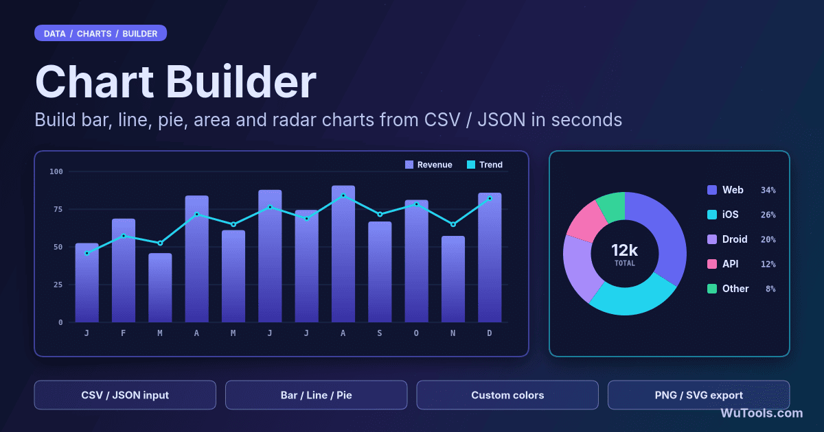
Chart Builder
Turn CSV or JSON into bar, line, area, pie, doughnut or radar charts. Stacked series, dark theme, custom colors, PNG/SVG/PDF export. Free.
About Chart Builder
Chart Builder is a free online tool for creating beautiful, interactive charts from CSV or JSON data. Choose from 7 chart types (bar, line, area, pie, doughnut, radar, polar area), stack bar and area series for composition analysis, apply a dark theme or a custom color palette, and export as PNG, raster SVG or PDF—all processed locally in your browser for complete privacy.
What chart types are supported?
Chart Builder supports 7 popular chart types:
1. Bar Chart - Compare values across categories
2. Line Chart - Show trends over time
3. Area Chart - Line chart filled under the curve, ideal for volume and composition over time
4. Pie Chart - Display proportions and percentages
5. Doughnut Chart - Like pie chart with center hole
6. Radar Chart - Compare multiple variables on a radial axis
7. Polar Area Chart - Show proportions with equal angles
Each chart type automatically adapts to your data structure and chosen color theme.
When should I use stacked bar or area charts?
Enable the Stacked option (available for bar and area charts) when you want to show how parts add up to a whole over a series. It is ideal for composition analysis such as revenue vs expenses vs profit, cost breakdowns by category, or traffic sources over time.
Stacked bar charts compare totals while keeping each segment visible; stacked area charts emphasise the cumulative trend. For non-stacked area charts each series fills to the baseline independently, which is better for comparing overlapping volumes.
Which chart type should I choose for my data?
Pick the chart that matches your question:
- Categories side by side: Bar Chart
- Trend or change over time: Line or Area Chart
- Parts of a single whole: Pie or Doughnut Chart
- Composition over time (parts adding to a total): Stacked Bar or Stacked Area
- Comparing several metrics across items: Radar Chart
- Proportions with a radial spread: Polar Area Chart
If in doubt, start with a bar or line chart—they read clearly for most business and financial data.
What data formats can I use?
You can input data in two formats:
1. CSV (Comma-Separated Values):
- First row must contain headers
- First column becomes chart labels
- Additional columns become data series
2. JSON (JavaScript Object Notation):
- Must be an array of objects
- First property becomes labels
- Additional properties become data series
Both formats support multiple data series for comparison charts.
How do I structure my data?
Your data should have at least 2 columns:
1. First column: Labels (e.g., Month, Category, Product)
2. Other columns: Numeric values (e.g., Sales, Expenses)
Example CSV:
Month,Sales,Profit
Jan,5000,1000
Feb,6000,1500
The tool automatically uses the first column for X-axis labels and creates separate series for each remaining column.
Is there a limit on rows or series?
There is no hard limit—everything runs in your browser, so the practical ceiling is your device's memory and the readability of the chart. A few hundred rows and a handful of series render instantly. For very large datasets (thousands of points) labels and legends get crowded, so consider aggregating or summarising the data first. Each numeric column after the first becomes its own series, and the color palette cycles or you can add more swatches in the Custom theme.
Can I customize chart appearance?
Yes! Customize your charts with:
- Color Themes: Default, Pastel, Vibrant, Monochrome, Dark, or a fully Custom palette you build swatch by swatch
- Chart Title: Add custom title text
- Legend: Show/hide data series legend
- Grid Lines: Show/hide background grid (bar/line/area charts)
- Stacked: Stack bar and area series for composition analysis
- Animation: Enable/disable chart animations
Export the finished chart as PNG, raster SVG or PDF. All customizations update when you regenerate the chart.
Does my data leave my device?
No. All chart generation happens entirely in your browser using JavaScript. Your data never leaves your machine, ensuring complete privacy for sensitive business data, financial reports, or confidential analytics.
How do I save my chart?
After generating a chart, use the Download button for a PNG, or the dropdown for raster SVG and PDF. The export includes all your customizations (colors, title, legend, theme background) and can be used in:
- Presentations and reports
- Websites and blogs
- Documentation
- Social media posts
Note: the SVG export embeds a high-resolution raster image inside an SVG wrapper for easy rescaling—it is not a true vector file. PNG and PDF keep full resolution for professional use.